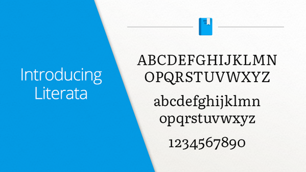
Some say that printed books are slowly dying, I don't think, but the news for those who consume eBooks is always welcome. Although they are generally cheaper than printed, eBooks still cause a certain discomfort in reading, depending on the device, of course.
Thinking about it, Google has worked since 2014 on a typography that is as beautiful and comfortable as printed books.
Because she came and her name is Literata.
Introducing Google Play Books' new font, Literata. Perfect for long reads on all devices. https://t.co/VQfT6oZvVU pic.twitter.com/eF3B1MJpkX
— Google Play (@GooglePlay) May 18, 2015
//platform. Twitter. with/widgets. js
Created in conjunction with TypeTogether, Literata is inspired by the classic sources of the story and arrives to replace Droid Serif, eBook standard on Google Play until then.

According to the company, the new source is ideal for reading on any device, whatever the size and resolution of the screen. The goal, too, is to create an identity for the books available in Google Play, differentiating from other services such as Kindle or Nook. So, just seeing the book, you know where it came from.
The new font has 1,100 characters and is in version 3.4.5 of Play Books.


Leave a comment